Logo design

Overview
This project was to redo a set of three logos that had been done previously in Graphic Design 2, which had been within the first two years of my graphic design journey. The initial logos were completely redone, the main similarity being the same company name used. I challenged myself to use better type lockup and exploration of type, as I had been previously unaccustomed to type in design. I was also challenged to create interesting designs that had a limited color palette, where the colors related to each other and the brand identity.
Designs in context

Logo 1
- The typography pairing of serif and sans serif adds sophistication while keeping clarity, while also showing off a better knowledge of type lockups.
- The minimal line-art style keeps the design versatile while also helping to symbolize the nutrition and mental wellness aspects of the brand identity.
- A soft, muted color palette communicates health, calm, and natural ingredients while the brain and sprouting leaves creates a strong visual metaphor to make the brand message memorable.
Logo 2
- Elegant and feminine design that uses a crown motif for emphasis on "Tiara" brand identity.
- The gold color palette evokes a feeling of luxury and quality while the decorative flourishes and heart accents add warmth and approachability to the branding identity.
- The hand-lettered script creates a personal feeling while still being readable.
- A balanced use of playful and structured text allows for versatility across various forms of packaging or signage.
Logo 3
- The design is friendly and approachable with bold script lettering and imagery to create a strong social media presence and be immediately eye-catching.
- The layered typography creates visual interest and depth while maintaining clarity and hierarchy, allowing for interesting lockup with type and image.
- The illustrated juice cup allows the viewer to instantly understand what the company is offering while adding personality.
COMPARISON of logos
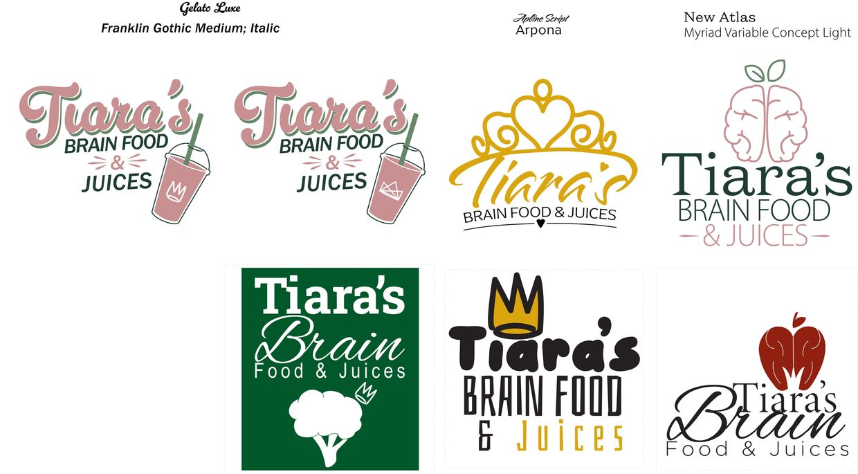
- The top three logos show refinement into more cohesive, brand-ready solutions that improve clarity, balance, and brand consistency.
- Cleaner compositions create better spacing and hierarchy, while making the designs feel more polished, modern, and versatile.
- The bottom logos are more experimental, but take a hit to readability and scalability.
- The brand message and icon have stronger alignment as well as the typography being more cohesive and balanced.